Join a community of 80K+
Used by talent inside

The design system startups and agencies use to save thousands of hours so they can craft what matters.
A UX tested Design System library for digital makers for Figma. Current version 2.0
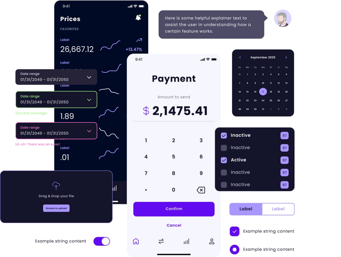
Custom Components
Token Variables
Original Icons
Styles & Effects
Stop wasting time on trivial work and boost your ability to craft on what matters most.
Eliminate design fragmentation and quickly transform components into unique branded products.

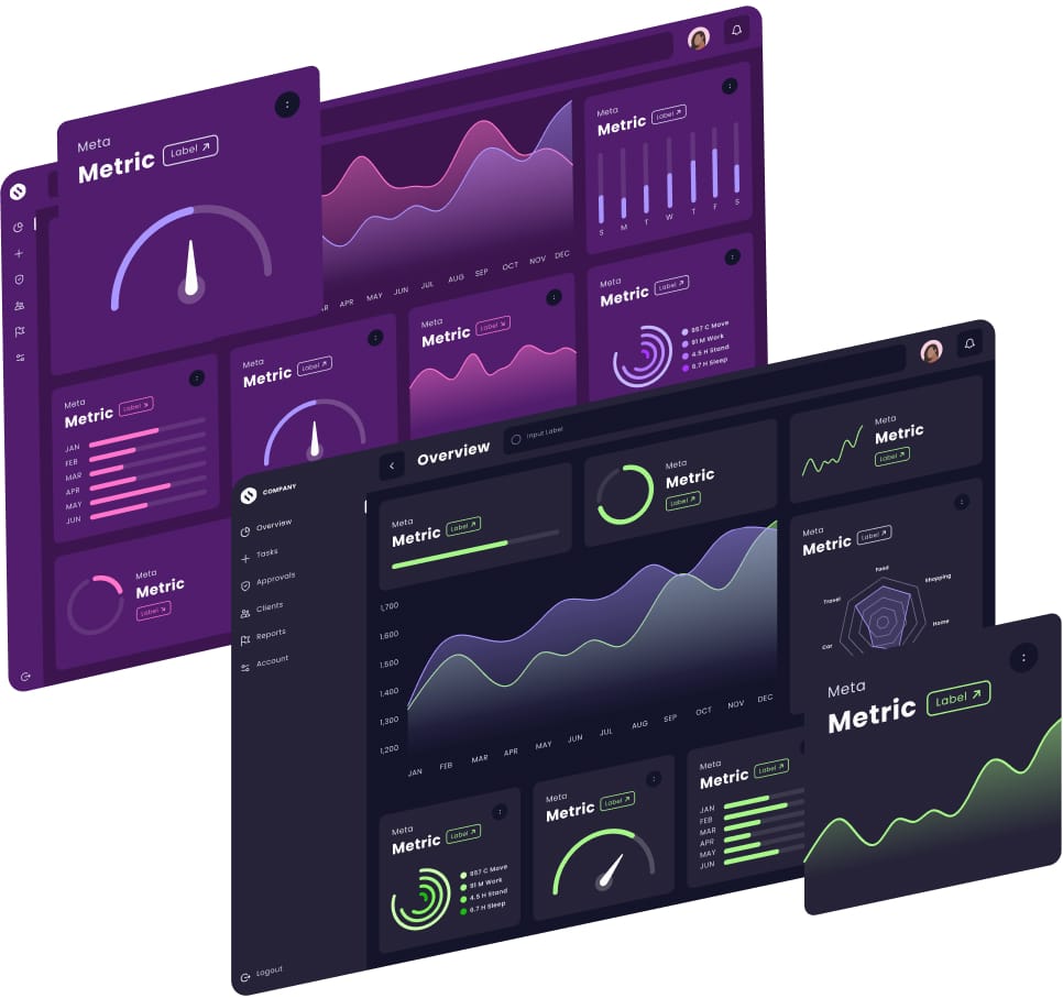
To help imagine all that can be designed with Pegasus, we included popular layout examples made for desktop and mobile too.
Let everyone use the products you create. Pegasus uses WCAG 2.1 AA rated contrast and focus states.

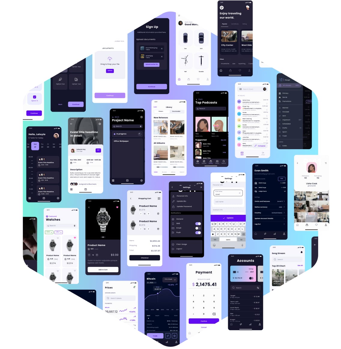
To help imagine all that can be designed with Pegasus, we included popular layout examples made for desktop and mobile too.

Design teams, front-end engineers and project managers all need a source of truth. Pegasus Design System can be customized to meet any brand.
Fly solo and crush design projects with ease.
The best value for fast growing teams who want to scale.
All the power of Pegasus with no limits on team size.
We want to educate and provide the highest quality resources and tools. If you have questions we want to hear them. These are the most popular questions we get asked.
What components, patterns, and guidelines does the design system offer? 1548 Custom Components +50% NEW, 113 Styles & Effects + 50% MORE, 456 Custom Icons X 9 Sizes - 115 More, 305 Variables - NEW, Theme Naming System - NEW, Light/Dark Modes - NEW, On Media Variants - NEW
Yes, Pegasus has a section called Foundations that can be easily updated to match your brands look and feel. It contains a Color System naming convention and Global, Theme and Variable - Design Tokens. Brand themes can be easily updated, Fonts can be customized and Blur Effects, Shadows can be tailored to perfectly reflect your desired look and feel. If you work with many clients or your organization is multi-product or multi-brand you will love how easy this system will accelerate your workflow.
Absolutely, having a design system can save costs. There's less time spent on design and development, fewer errors to fix, and an overall smoother process from ideation to launch.
Pegasus is hand crafted to be pixel-perfect and includes Documentation assets ready for engineering team hand-off. PDS includes: Anatomy, Properties, Layout and spacing. Development teams will love having detailed information on each and every element.
Design systems emphasize accessibility standards, ensuring products are usable by as many people as possible, including those with disabilities. By using these systems, startups and agencies can confidently provide designs that adhere to best practices for accessibility, which can also be a legal and ethical necessity.
With a design system, designers and developers can use pre-defined components and patterns rather than reinventing the wheel each time. This speeds up the design and development process considerably, enabling faster delivery.
Yes, Pegasus Design System is built to cover both Desktop and mobile devices. Components and patterns have multiple sizes and have been carefully considered to be responsive.
With Pegasus Design System you can leverage smart components and patterns with multiple: Types, Colors, Sizes, With starting and ending Add-Ons, with Swappable Icons, Themes for On-Media, Light and Dark modes.
Design systems provide a consistent set of guidelines, components, and patterns. This ensures that every part of a product or website looks and functions consistently. It reduces the chances of visual or functional discrepancies, which could otherwise negatively impact user experience.
As products or projects grow, having a design system in place makes it easier to scale. When new features or pages are required, designers and developers can leverage the existing system, ensuring that the brand and user experience remain consistent.
Design systems serve as a single source of truth. Both designers and developers can reference it, ensuring they're on the same page. This reduces the back-and-forth and potential misunderstandings between teams.
A well-defined design system sets high-quality standards for aesthetics, usability, and accessibility. This ensures that the end product meets or exceeds these standards, leading to a better user experience.
When updates or changes are needed, having a design system means changes can be made in one place and propagate throughout the product. This makes maintenance faster and less prone to errors.
For new team members, whether they're designers, developers, or even product managers, a design system provides an immediate introduction to the product's design philosophy, components, and guidelines. This makes onboarding more efficient.
Agencies, in particular, can use design systems as a foundation and customize them according to the specific brand and needs of each client. This gives them a head start while still providing tailored solutions.
With the foundational design decisions already made and integrated into the system, designers can focus on higher-level creative tasks and innovative solutions rather than getting bogged down in the basics.
With a set baseline provided by the design system, it becomes easier to conduct A/B tests and other user research to iteratively refine the user experience. Without a system in place, it's harder to pinpoint what's working and what isn't, as there might be too many variables at play. A design system narrows the focus, allowing for more precise adjustments based on user feedback.
Especially relevant for agencies working with multiple clients, a design system can ensure that each client's unique brand is consistently represented across all digital assets. Whether it's the color scheme, typography, or any other design element, having a system in place means that the client's brand identity remains intact and recognizable at every touchpoint.
Jumpstarting a design system? Pegasus might be the perfect resource.
- Figma Core Team