Based on Pegasus for Figma
80K users in over 100 countries
Including professionals inside...
 Buy now
Elevate your react projects with our popular Pegasus Design System built on MUI.
Features
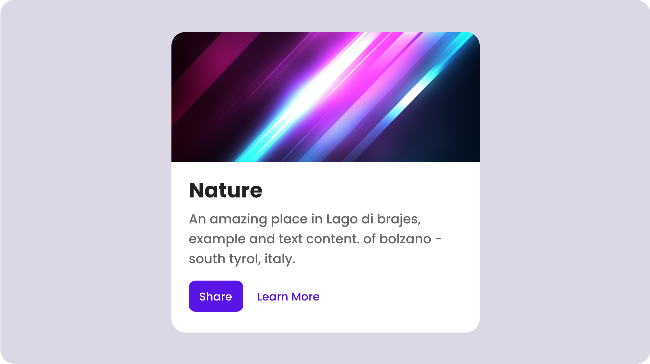
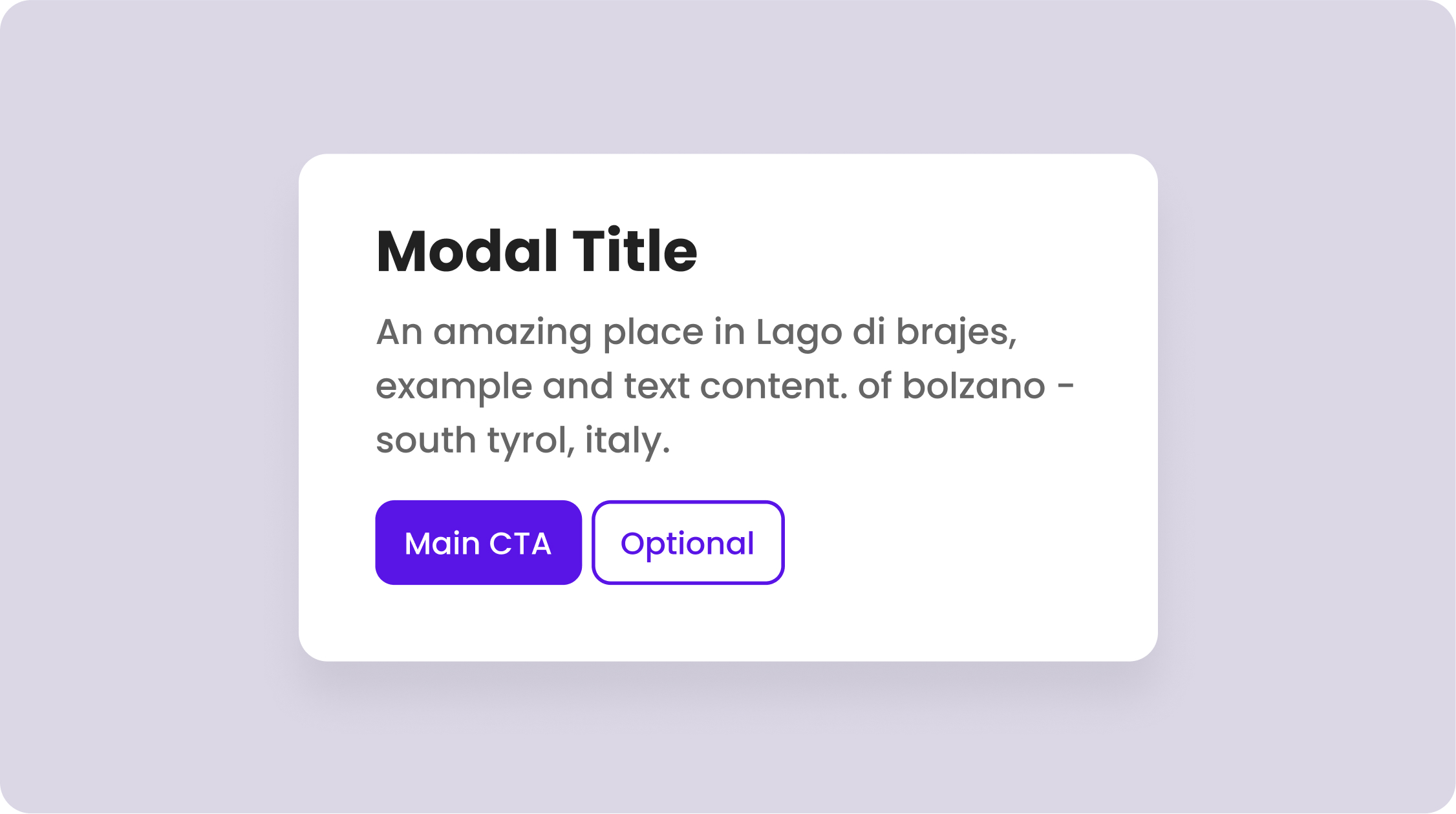
Moving quickly doesn't require sacrificing your brand's unique style or accessibility.
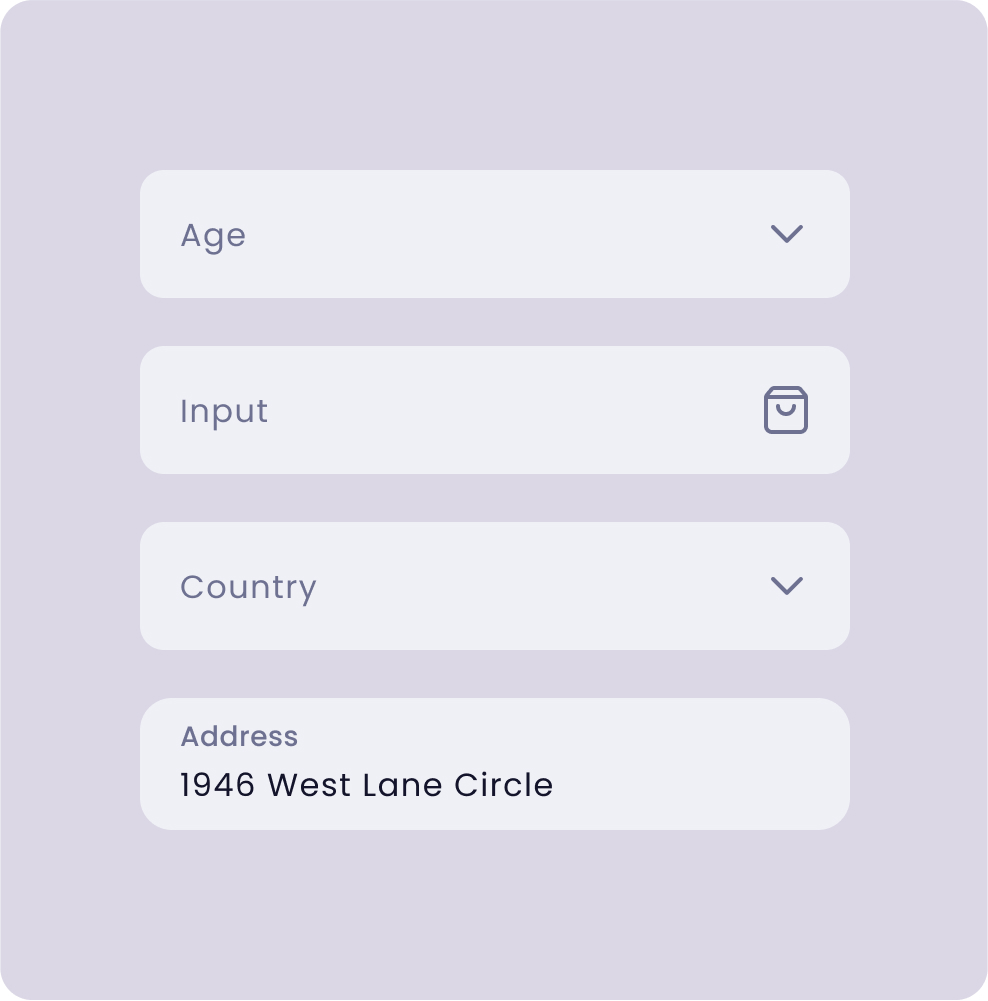
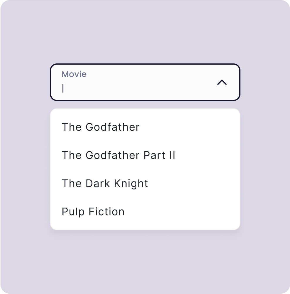
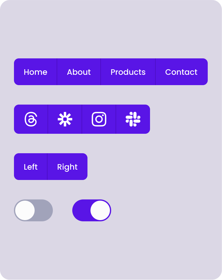
Pegasus React.js Component Library allows you to build apps at scale without sacrificing quality.
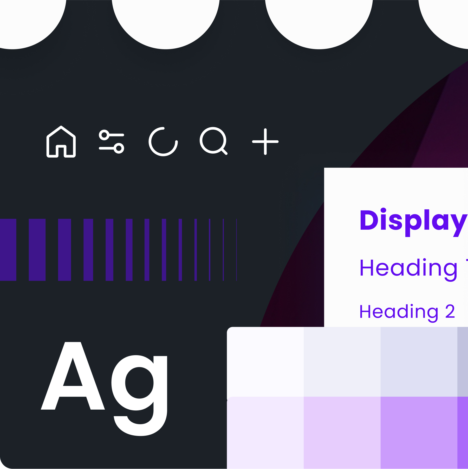
With a full set of custom icons you can control the styling and size of the custom line and filled icons.
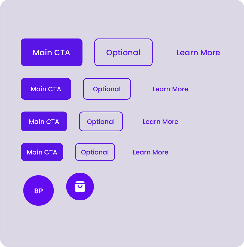
Leverage reusable token variables representing design attributes to scale your products and go multi-brand.
Based on Pegasus for Figma
Including professionals inside...
Buy now
Pegasus features a theming engine, with it designers can create a unique visual identity for their products, making them instantly recognizable to users.

Our library supports plain JS or Typescript, providing the flexibility you need to structure your app architecture in a way that works for you.
Storybook streamlines testing, visualizing and configuring React components within isolated development an environment.
Preview
Meticulously designed for optimal functionality and aesthetic appeal.
Pricing
Take flight and crush your projects.
The best value for fast growing teams who want to scale.
FAQ
Answers and insights into the most common queries.
To provide a set of reusable UI building blocks called "components" for building web applications faster and more efficiently.
Developers who use React for building web applications and want great accessibility, performance, and speed of iteration.
If you are tired of wasting time starting from scratch on every project and want to speed up your workflow and that of your fellow cross-function team members.
Simplicity, reusability, and consistency of all UI elements which provides a great user and developer experience.
If development teams are frustrated trying to integrate designs that are lacking in pixel perfection or missing use cases, Pegasus can help alleviate those concerns and streamline the product development process.
If your team wants to promote inclusive design with full accessibility but are too bogged down balancing priorities to simply stop and shore up items like focus states and color contrast this product can help short cut the work required.
If you are experiencing Design Fragmentation across teams, projects or products and the results no longer look and feel like they come from the same company setting up a Design System is a great solution.
If you setup a single source of truth for UI Components your codebase can avoid the duplication that leads to technical debt and higher maintenance costs.
If you have a large spread of levels or stylistic preferences on a team, having a Design System can help your users be able to memorize the common methods of using your product.
Establish a user feedback loop, track bug reports, and evolve community support.
What's Next?
We develop based on your experience needs.
Completed ✓
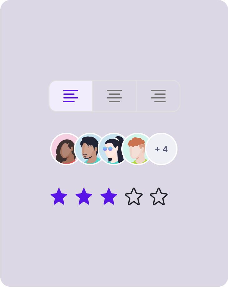
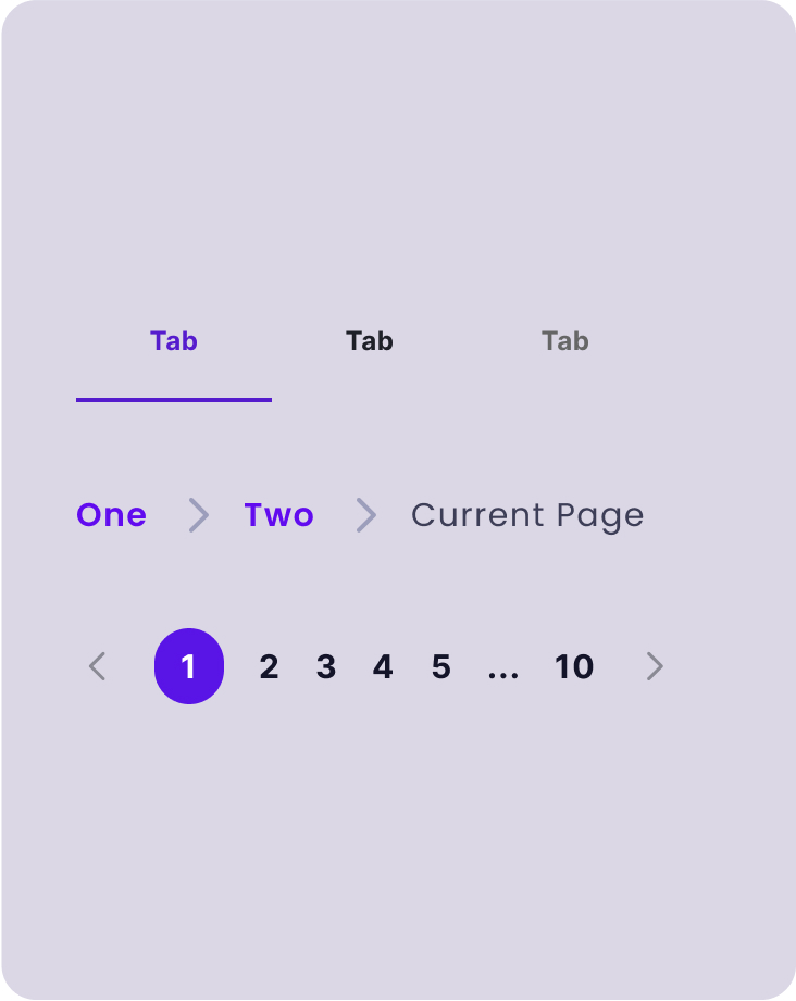
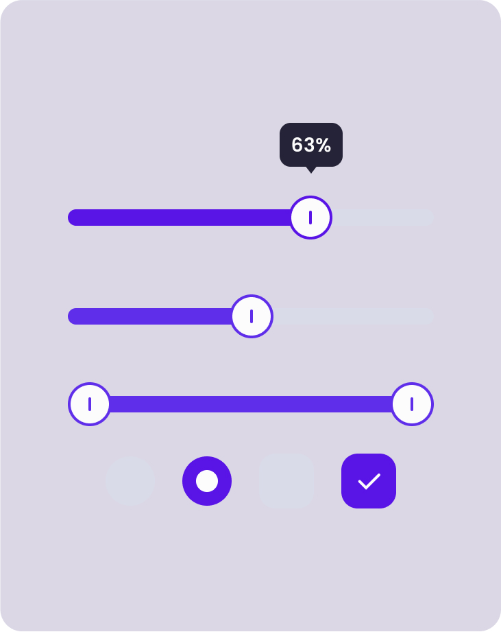
Coverage for the most used and powerful component.
Line and filled options to help you express your message.
Next
Support dark mode theming for your app.
Graph and Chart theming support to better support your brand.
Multiple style variants for components, e.g. Classic, Modern, Playful…
Future
Work from the best tested marketing patterns.
Selling products based on making the products be the star.
See Pegasus in action with a dashboard example app.
New higher level widgets using the core components.