Design at Scale
Save months and start building ultra consistent, ultra accessible, ultra fast Figma product design for massive growth and scale today with UltraUI!
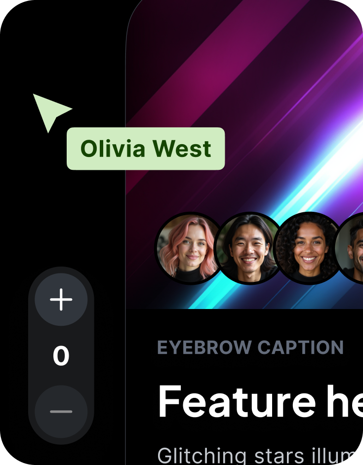
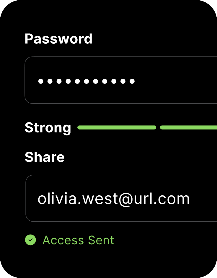
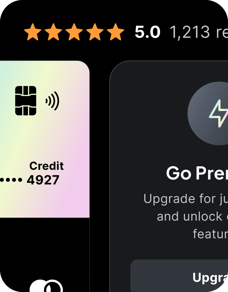
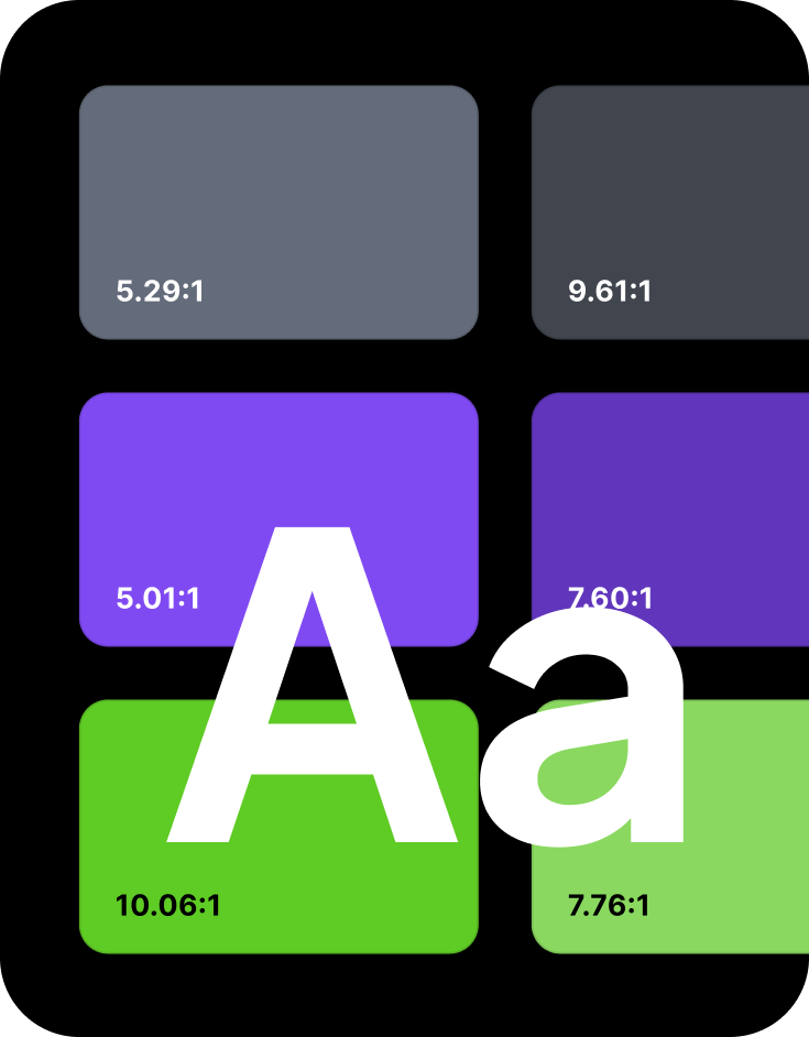
Save months and start building ultra consistent, ultra accessible, ultra fast Figma product design for massive growth and scale today with UltraUI!


Designed from the ground up to solve the most painful design to development problems seamlessly.
Say goodbye to chaos! Pegasus UltraUI starts you off right, ensuring your brand looks cohesive across all platforms and products.
Stop reinventing the wheel. UltraUI Design system provides ready-to-use components, saving time and resources for everyone.
Grow your product design without the growing pains. UltraUI's design adapts seamlessly as your product expands to new features or platforms.
No more silos! Your design system creates a shared language between designers, developers, and stakeholders.
Stand out from the crowd. A solid design system strengthens your unique brand voice and visual identity.
Delight your users consistently. Design systems ensure intuitive, familiar interactions across your entire product ecosystem.

Moving quickly doesn't require sacrificing your brand's unique style or accessibility.
Pegasus React.js Component Library allows you to build apps at scale without sacrificing quality.
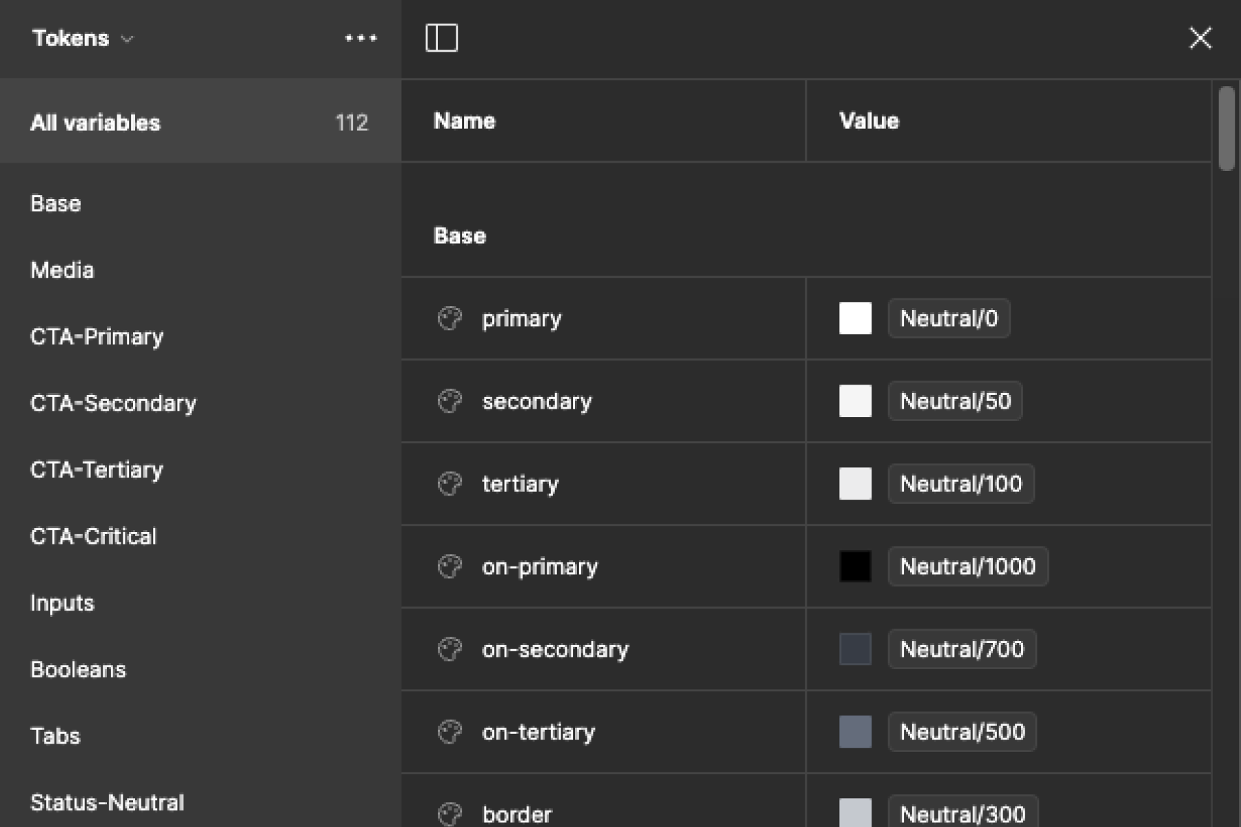
Leverage reusable token variables representing design attributes to scale your products.
Customize type and color variables in 5min to tailer multi-brand themes for your use cases.
UltraUI is designed to cover 80% of the top 100 websites and apps.
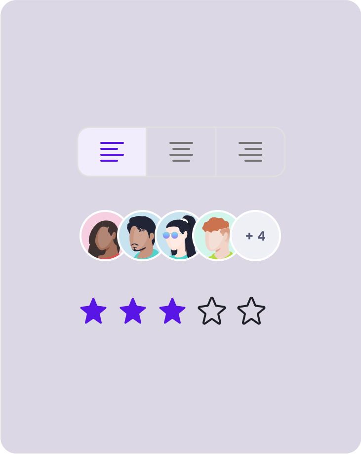
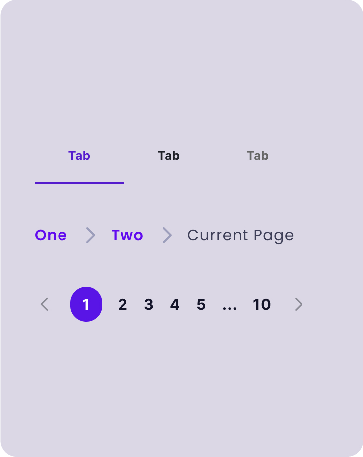
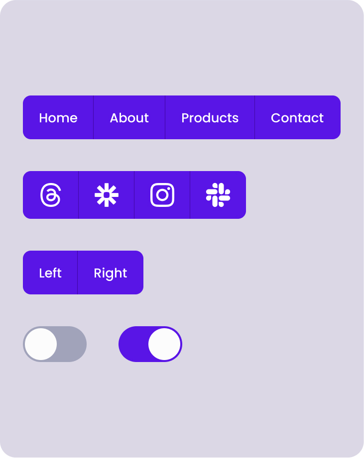
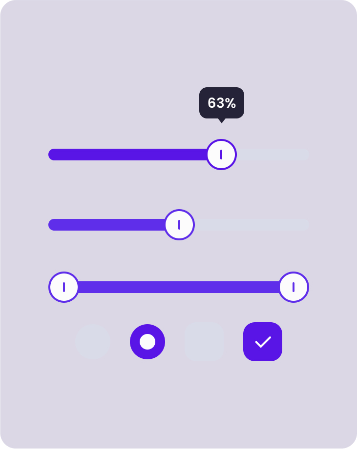
Pre-built, customizable UI elements at your fingertips. Mix, match, and modify to create stunning interfaces in record time.
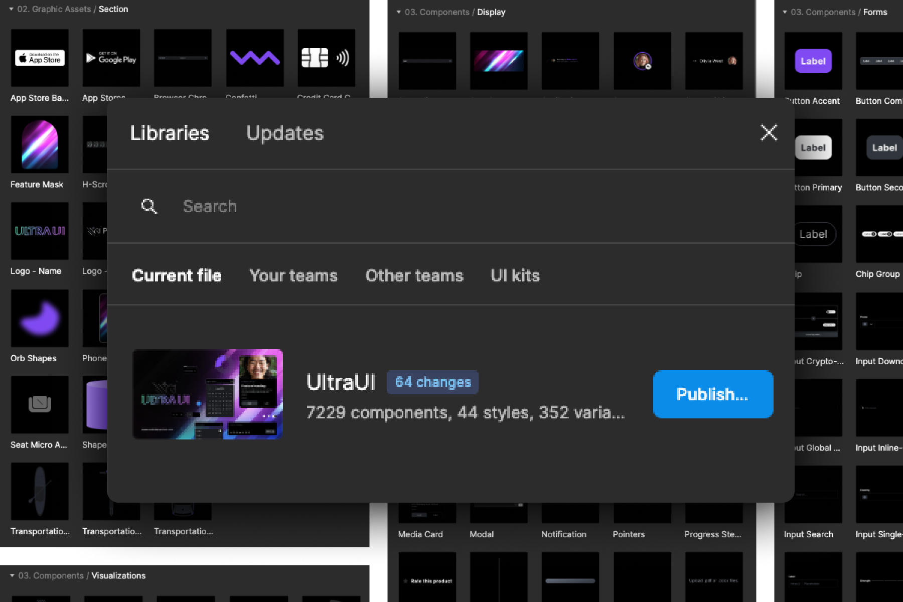
Forget manual resizing headaches. Auto-layout adjusts your designs intelligently, saving hours of tedious work.

One component, multiple states. Create variations for different screen sizes and interactions without starting from scratch.

Brand consistency made easy. Apply and update color palettes across your entire design system with a few clicks.

Thousands of icons, zero hassle. Searchable, customizable icon libraries to enhance your designs instantly.
Perfect text hierarchy, every time. Predefined text styles ensure your content looks great and stays on-brand.

Switch it up effortlessly. Toggle between light and dark themes to cater to all user preferences.
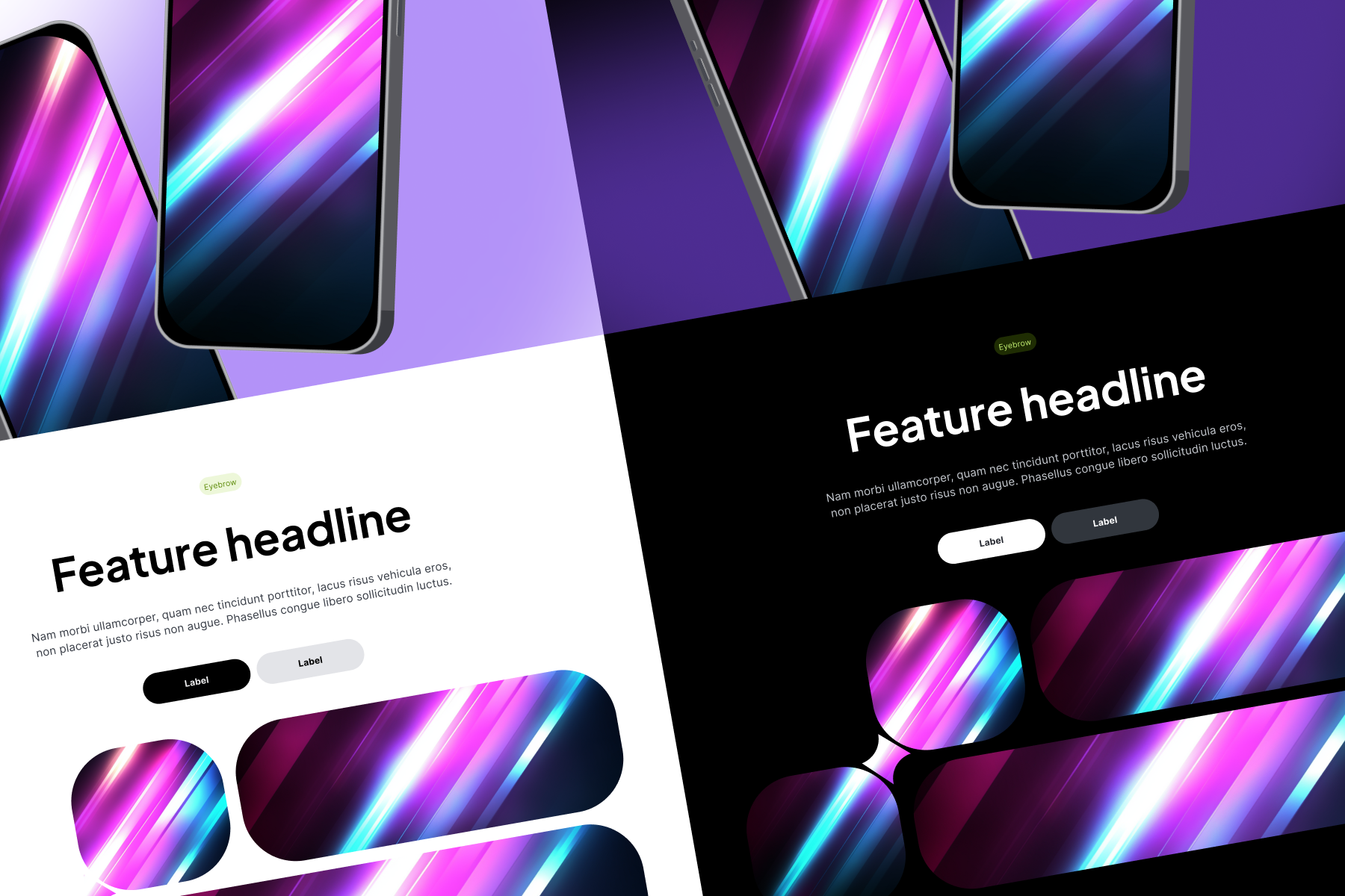
Ultimate flexibility meets consistency. Modify global design elements across your entire system in seconds flat.
Preview
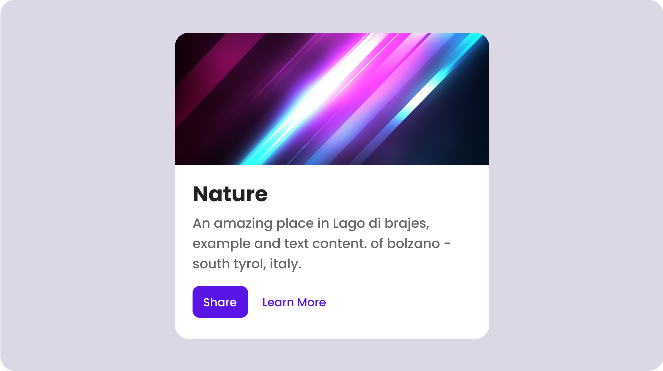
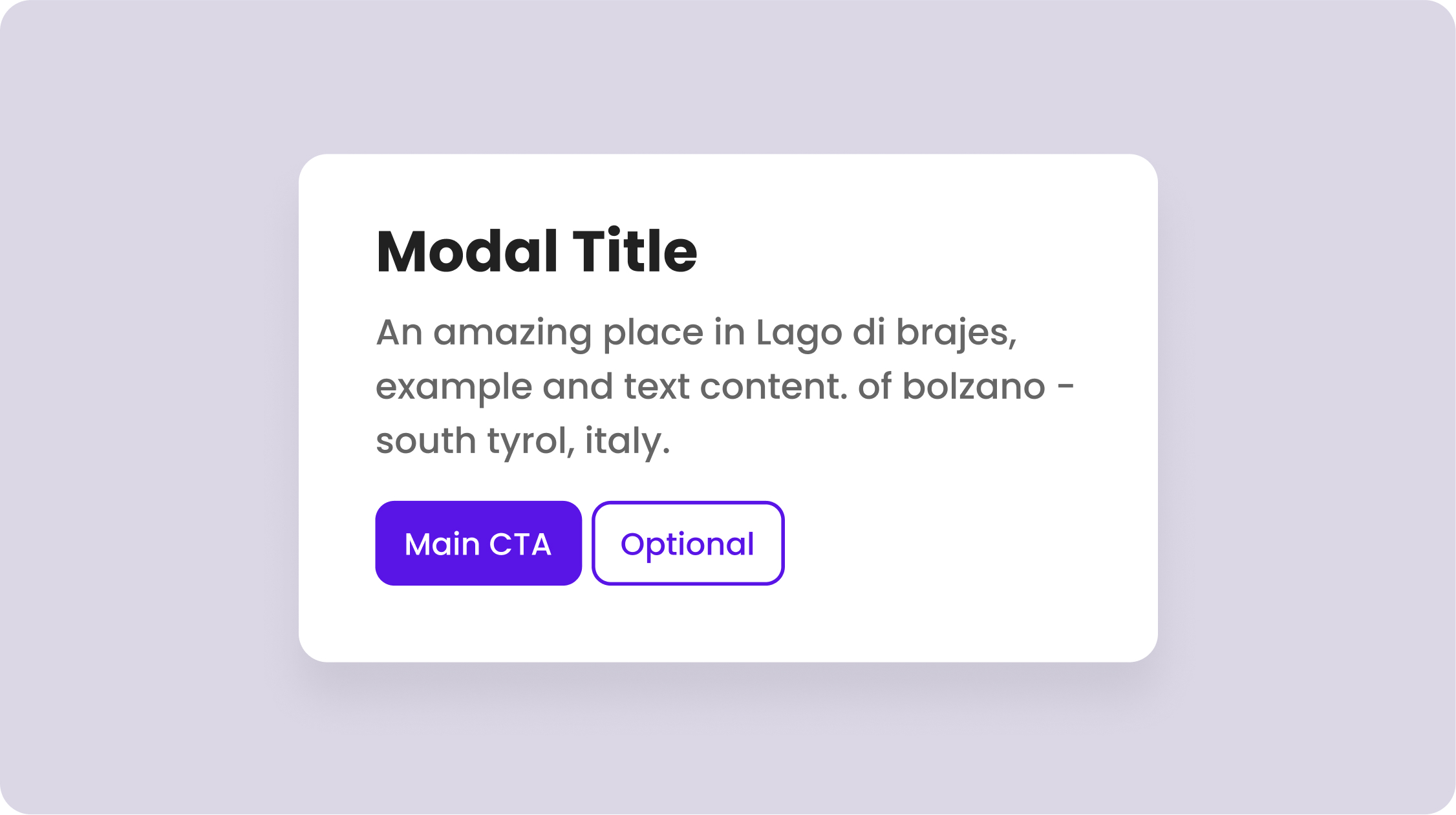
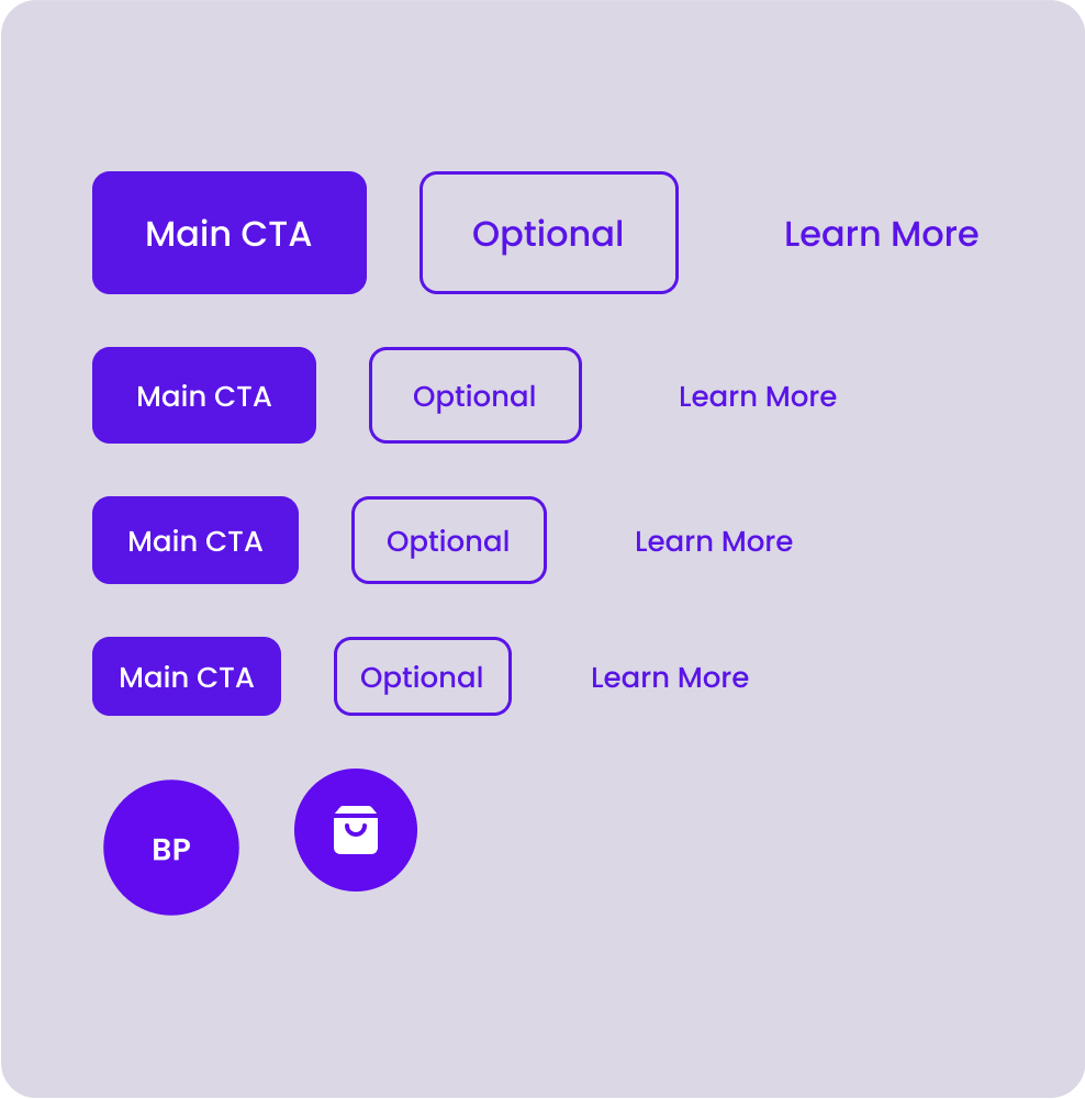
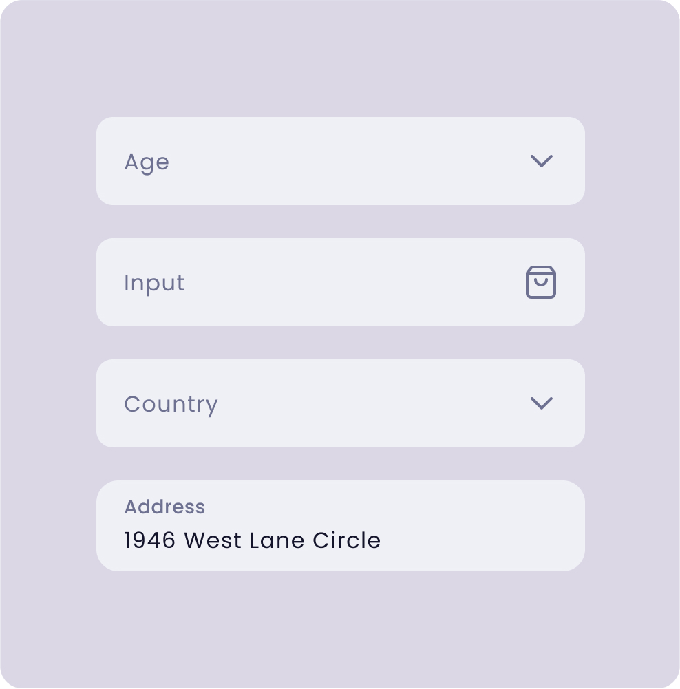
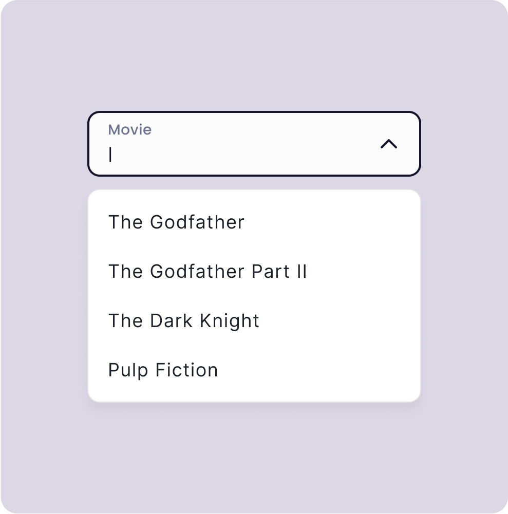
Meticulously designed for optimal functionality and aesthetic appeal.
Pricing
Take flight and crush your projects.
The best value for fast growing teams who want to scale.
FAQ
Answers and insights into the most common queries.
To provide a set of reusable UI building blocks called "components" for building web applications faster and more efficiently.
Developers who use React for building web applications and want great accessibility, performance, and speed of iteration.
If you are tired of wasting time starting from scratch on every project and want to speed up your workflow and that of your fellow cross-function team members.
Simplicity, reusability, and consistency of all UI elements which provides a great user and developer experience.
If development teams are frustrated trying to integrate designs that are lacking in pixel perfection or missing use cases, Pegasus can help alleviate those concerns and streamline the product development process.
If your team wants to promote inclusive design with full accessibility but are too bogged down balancing priorities to simply stop and shore up items like focus states and color contrast this product can help short cut the work required.
If you are experiencing Design Fragmentation across teams, projects or products and the results no longer look and feel like they come from the same company setting up a Design System is a great solution.
If you setup a single source of truth for UI Components your codebase can avoid the duplication that leads to technical debt and higher maintenance costs.
If you have a large spread of levels or stylistic preferences on a team, having a Design System can help your users be able to memorize the common methods of using your product.
Establish a user feedback loop, track bug reports, and evolve community support.
What's Next?
We develop based on your experience needs.
Completed ✓
Coverage for the most used and powerful component.
Line and filled options to help you express your message.
Next
Support dark mode theming for your app.
Graph and Chart theming support to better support your brand.
Multiple style variants for components, e.g. Classic, Modern, Playful…
Future
Work from the best tested marketing patterns.
Selling products based on making the products be the star.
See Pegasus in action with a dashboard example app.
New higher level widgets using the core components.