
Many people want to build a design system but are not sure where to start with design tokens. In this article we will go over the top Design Tokens that should be in any design system to allow you to save time and design higher quality and more consistent products.
Defining Design tokens
Design tokens are the smallest part of a design system; they are the presets that all other components inherit to By defining your Design tokens it will allow you to reuse these elements and ensure that your components stay extremely consistent and on brand.
Color Design Tokens
Defining your color palette is the first step in developing a strong design system. There are many ways to do this, but we recommend starting with Global shades and tints You’ll have multiple shades of common colors that span the rainbow.

How to organize design system colors
You could think of this as coverage for any change in branding that you would want to use in the future. This is a great way for designers who want more control over their designs to lock these down while still having some flexibility when needed)
How to name global color palettes
One common approach is to name your colors from 50 through 900 in relation to their shade. It’s helpful to know they’re hex value and also what color text or contrast color should be used for accessibility. Some Design Systems even go as far as listing the contrast ratio and their WCAG AA or AAA rating.
What are Alias Design Token Colors?
Next Alias colors are chosen that align with the brand identity of the company the product is created by. These Alias colors can be neutral colors for typography and form inputs and Primary and Secondary Brand colors to cover interactive elements and call outs.
Gradients
Gradients can be included but only if there is a specific need for them or they are part of the brand identity.
Typography Design Tokens
The next area is typography, where you want to create a stack that will define common attributes such as your H1 through 6 headings. Variance for bold and thinner weights are also included in the package along with body presets at various sizes as well as link styles.

Documentation examples of Typography
It’s important when designing an interface – which has numerous different elements, to have a type preset stack but also documented example representation so people can understand how things work visually without having existing knowledge of the system.
Spacing Design Tokens
Spacing either in the form of cribs or vertical Rhythm presets allows for predictable and more consistent layouts. These usually fall into two structures called base 8 or base 4. they’re defined by 4 pixel or 8 pixel increments that these common numbers are divisible by.
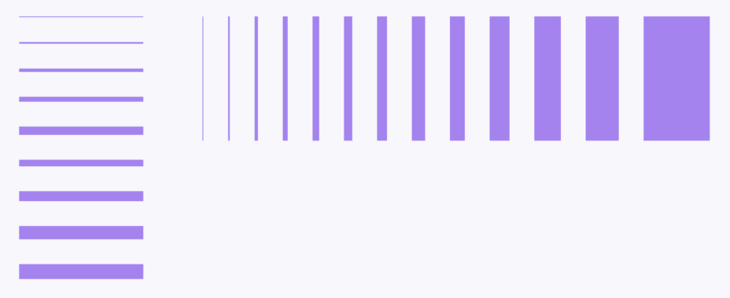
Vertical rhythm spacing scales
An example of a common scale would be 4, 8, 12, 16, 24, 32, 40, 48, 56 Etc. in most cases relying on base 8 will get the job done but if there are specific areas where typography spacing or other component measurements need finer granularity. Square a number which relies on base for can be incorporated.
Design Token Grids
Grids falling too many different approaches such as a fixed grid which is commonly centered and constrained by a maximum with usually around 1200 pixels and then divided up into vertical columns is popular.
Flexible or fixed grids in design systems
For a more dashboard or editorial use it is common to see a flexible grid where the layout is stretched to the outers with the device and flexes based on changes in browser width. In either case the grid that is selected is usually based on the type of product that is being developed.
Use grids based on your app needs
In some cases you could be designing a very spacious and Airy landing page where the space between the columns referred to as gutters needs to be wider and that gutter could be customized to something larger. In other cases you might be building for dense information such as a table based line of business app or mobile app with many features commonly referred to as a super app.
12 Column Design Grids
In these cases a 12 column grid allows for more granular adjustments and better support of dense informational layouts.
Radius Design Tokens
One of your branding elements is the radius or the roundness of your elements. Different sizes demand different levels of corner radius for example, an extra small button might have a radius of 4 or 8 where a large card hero background might have a radius of 24 or even 32. can be helpful to have several radius presets defined in your design tokens this will allow various components to utilize the radius preset that is best aligned to the size ratio.
Depth and Shadow Design Tokens
Google’s material design is an innovative and impactful way to implement the concept of depth. Based on the size and state of an element it might have a larger darker Shadow or a lighter and smaller shadow. Shadows communicate adds much more than just visual appeal – user feel more like they are using real objects that react to distance and shadows cast by the sun in our natural world.

Naming conventions for UI Shadow Design Tokens
How we interact with these elements can change their styling. How you set up your Design Tokens are up to you but they can be arranged into presets. They can be anything as simple as t-shirt sizing: (small medium large) all the way up to a 1 through 10 increment scale.
Design Token Borders
Sometimes around an element you’ll want to show a border. Borders can communicate a higher sense of contrast or a separation between elements. What is common can range from 1 pixel to 4 pixels depending on their size and scale.
Defining border colors or just weights
Information about color application can also be defined along with these presets. for icons that are drawn in line Style borders will typically range from 1 pixel all the way up to as high as 8 pixels as an icon scales from 16 pixels to 24 and all the way up to 48 or 128.
Logo Branding as Design Tokens
It’s possible to style a preset for Logos and branding this helps keep logo use orientation size and whether using a type Mark or only a brand Mark consistent across the app.
Design Tokens and Omnichannel Marketing
We know from user research that when a brand uses their identity in a consistent way it communicates that there is one company speaking in one voice. This visual consistency provides assurances of legitimacy and professionalism that help produce higher conversion rates and higher quality and satisfaction survey results.
Sounds as Design Tokens
Interactive, engaging sounds can make a variety of different types of products more exciting and less boring. For example: some brands utilize jingles or certain interactive noises to keep the attention on their product while they are being advertised which makes them stand out from other competitors’ similar items in stores at that time because these particular tunes would not have been very memorable without this added component!
Why tokenize branding sound effects
Just like any other attribute of the brand it’s important for there to be accuracy when associating a sound with brand identity. Tokenizing sounds allows them to be utilized in a way that is more consistent and also more easily maintained. There are also many needs of apps which have their own specific sound interactions built in. All of these can be added to your design tokens for easy reference and allows developer immigration to be fast and seamless.
Blur Styles
With the adoption of CSS Blur we can now add blur presets to our design tokens. Defining Blur allows design and development to provide better accessibility when adding blocks of text on a media image or other busy background that with blur would be difficult or non-sighted or sight reduced users.

Exporting Design Tokens for Engineering and Development
Common exports of these key value pairs are as .JSON or YAML files that bridge from design to development and can be stored in project repositories like GitHub.
We hope this has been helpful in defining your Design Tokens. Let us know below what you plan to add to your company Design Tokens.